A fast-fashion brand built for Gen Z had a shop page working against them. Eleven specific failures later, conversion was up 15% and bounce rate down 12%.
Role
Accountable for user flows, explorations, interactions, visuals and prototyping
Team
1 product manager · 4 engineers
Research
User interviews and an online study, run with my PM
Timeline
Jul — Aug 2024
Outcome
+15% conversion · −12% bounce rate
The call I made
Reject “make it look current” as the brief, and rebuild the page around the cost of the next decision. Every change had to make one specific decision cheaper — which size, which colour, which price, what else is like this.
The trade-off: product titles lost space, which the content team wanted, because the research said names were not a priority for shoppers and price, size and colour were.
I owned
Problem framing and the reframed brief
User flows, explorations and interactions
Visual design and prototyping
I partnered on
User interviews and the online study, with my PM
Build feasibility with four engineers
Merchandising priorities with the content team
Where the judgment was
Choosing discoverability over decoration
Trading product-title space for price, size and colour
Moving filters into the grid rather than behind a screen
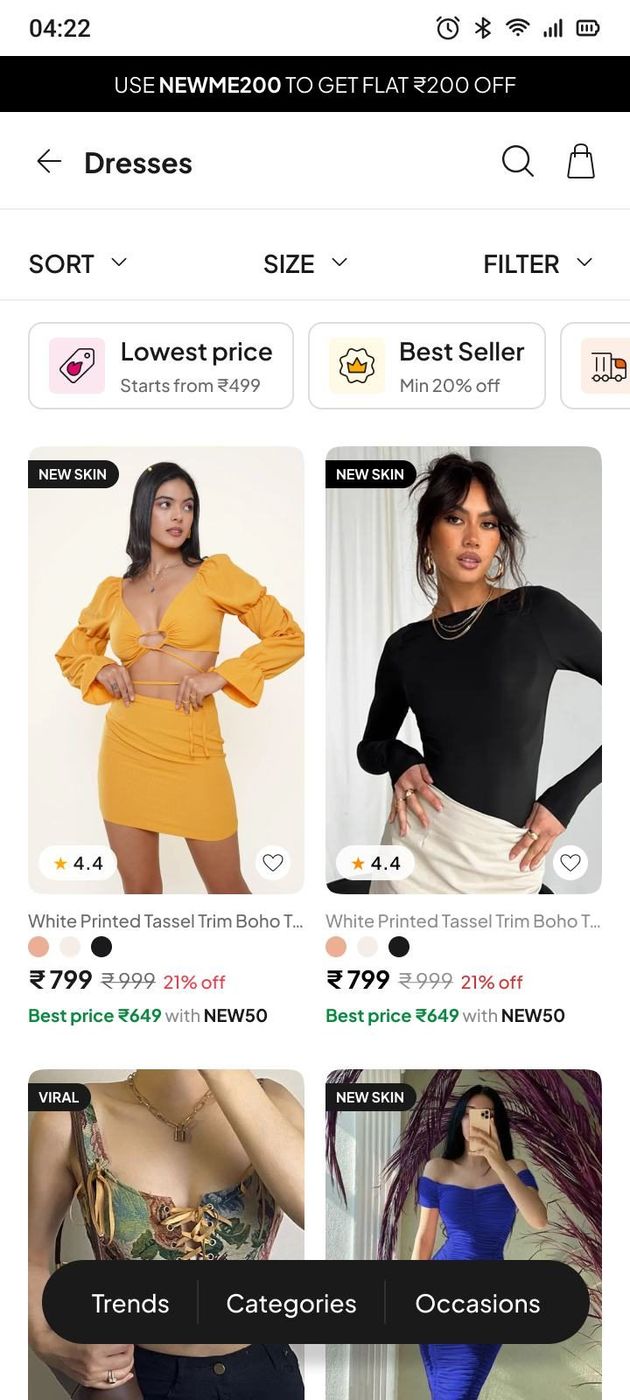
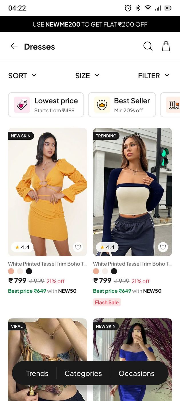
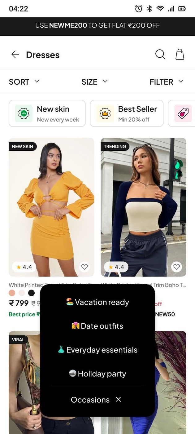
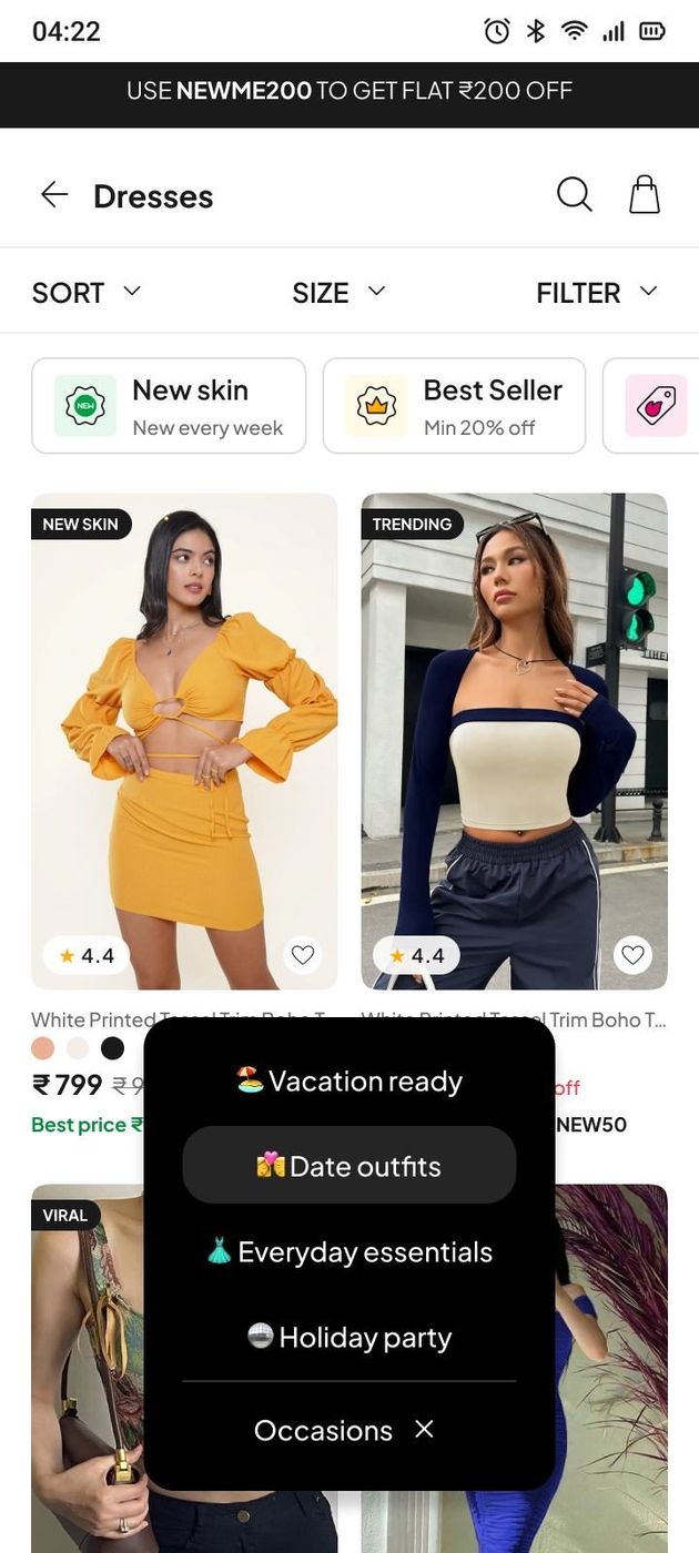
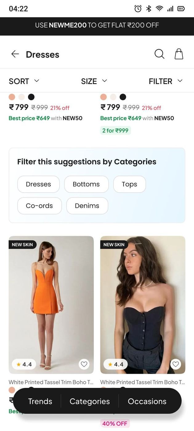
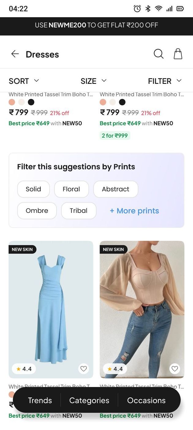
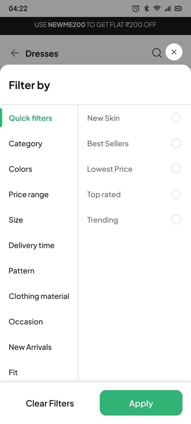
The redesigned shop page.
Context
Newme is a fast-fashion brand built for Gen Z, and the shop page is where most of a session is spent. It had not been designed for how that audience actually shops: mobile-first, fast-paced, and impatient with anything that stands between them and the next thing worth looking at.
The brief was to improve usability, organisation and engagement. I explored the page against real behaviour and conversion data, then rebuilt it around one idea — make the next decision cheap, whether that decision is a filter, a size, a price comparison or a colour.
What was actually broken
Eleven specific failures, not a vague feeling that it looked dated.
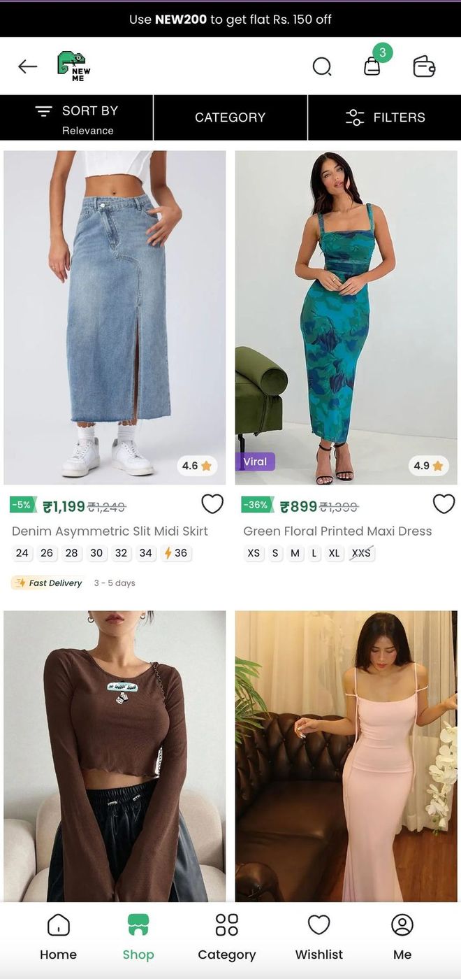
Cluttered interface. A large black button and excessive text made the page hard to navigate.
Poor navigation structure. Sorting, filtering and category selection were unintuitive, and frustrated users.
Ineffective promotional space. Important deals and fast-delivery options were not highlighted.
Confusing bottom navigation. People struggled to find essential features.
Size availability. Users left when their preferred size was out of stock.
Limited product discovery. Similar items were only visible on the product detail page.
Unclear pricing and discounts. Discount percentages and original prices weren't emphasised.
Overemphasis on product titles. Names took up excessive space and weren't a user priority.
Promo code confusion. Users expected to copy the discount code from the banner, but couldn't.
Hidden colour variations. Colour options were overlooked because they weren't visible on listing pages.
The goal
Enhance the user experience, increase engagement and improve conversion. Five focus areas: better navigation and accessibility; product discoverability through layout and recommendations; discounts, promotions and fast delivery made visible; less cognitive load through a simpler UI; and a genuinely frictionless mobile experience.
Looking outward
What the category had already worked out.
Fast-fashion players studied for navigation, filtering and promotional patterns.
How a competing app handles sort, category and filters in one bar.
What changed
Enhanced product cards
Ratings, product tags, wishlist, coupon applicability and colour variations were added to the card, and the distinction between original and discounted price made unmistakable. The point is that a shopper should be able to reject or accept an item without opening it.
Revamped navigation and category structure
A dedicated bottom navigation for Trends, Categories and Occasions. Trends refresh monthly with curated selections — Summer Trends, Corsets, Gingham, Workwear. Categories stay comprehensive: Tops, Bottoms, Dresses, Co-ords, Jackets. Occasions do the job a shopper actually arrives with — Vacation Ready, Date Outfits, Holiday Party.
Mid-scroll filters
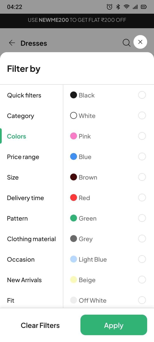
Filters that appear inside the product grid, so preferences can be refined without leaving the page — price range, bestsellers, trending, categories, prints. Removing the round trip to a filter screen is the single biggest reduction in friction on the whole page.
A filter system that matches how people choose
The old filters stopped at colour, price range, size and delivery type — a banner rather than a functional tool. The new set adds Pattern, Clothing Material, Occasion, New Arrivals, Fit, Discount, Neckline, Closure Type and Sleeve Type, and sorting gained Lowest Price, Highest Price, Best Sellers, New Arrivals, Trending and Fastest Delivery.
Key results
Measured after launch.
15%▲Conversion
32%▲Sorting and filter usage
12%▼Bounce rate
14%▲Add to cart
10%▲Average order value
11%▲Checkout completion
18%▲Promo code usage
26%▲Promo visibility and copies
8%▲User retention
Closing note
The redesign made the interface more visually engaging, but the win came from product discovery and decision-making clarity, not decoration. With improved filtering, better product visibility and enhanced promotional clarity, people browse, compare and purchase with ease — and the pace of that change fed directly into engagement, conversions and a more satisfying shopping journey.
Happy to walk through the parts that didn't work, too.